

The world has never been better but it feels like things are getting worse.
We see so much more bad stuff than previous generations because of our access to a limitless amount of information.
Don’t get me wrong — we have a lot of problems and always will. But things are much better than the headlines would have you believe.
For example, look at the share of the global population living in extreme poverty:
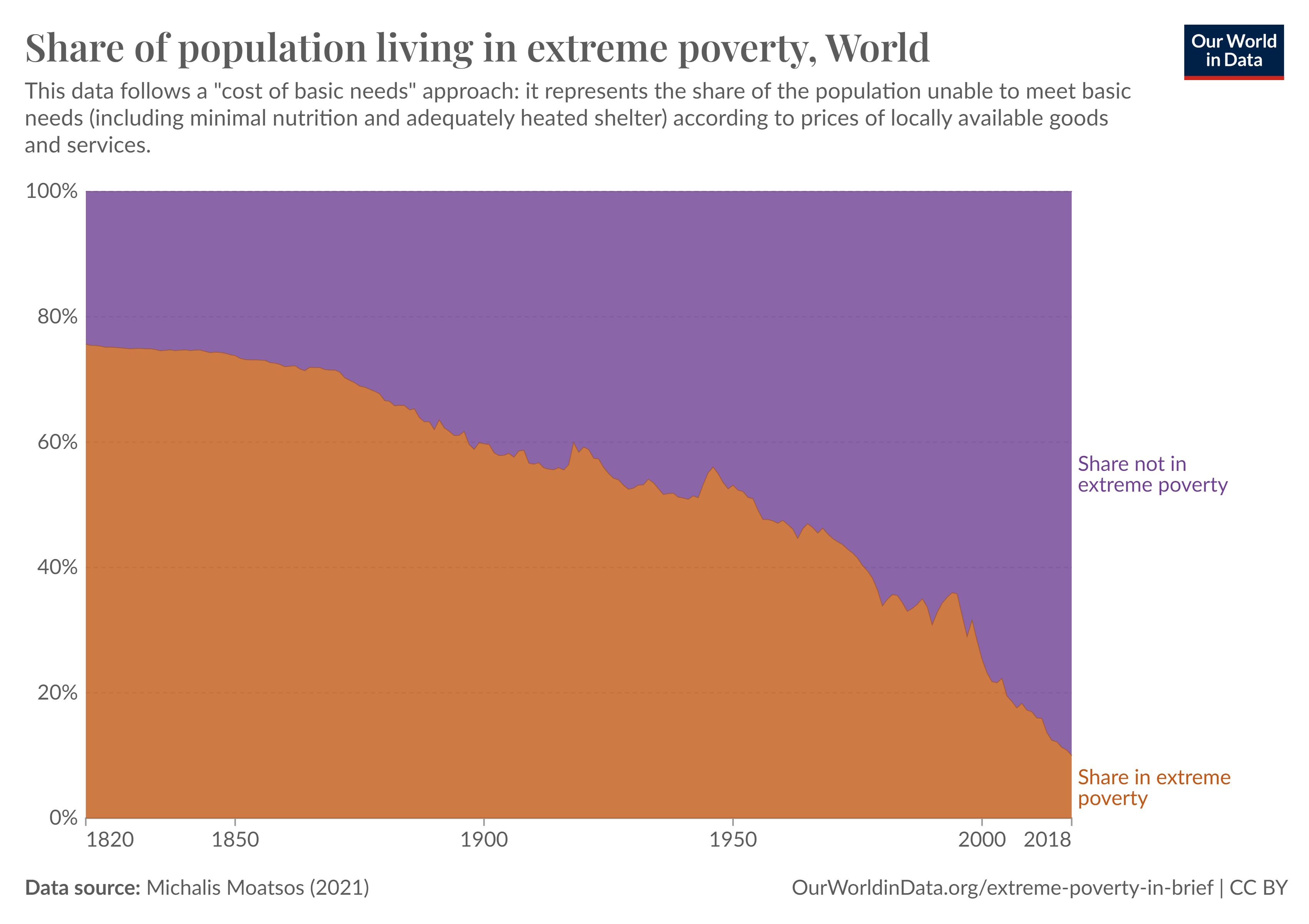
It’s in a massive drawdown (in a good way).
Most of the world’s population lived in extreme poverty until relatively recently. This is the kind of slow and steady progress you’ll never see on the news.
As we improve as a species, the goalposts of success can and will move.
Max Roser, the founder of Our World in Data, who published the poverty chart, recently penned an op-ed in The New York Times calling for a new measure of poverty.
Roser started by laying out how far we’ve come:
Until fairly recently the majority of humanity lived in what we would now consider extreme poverty. Just two centuries ago, about three-quarters of the world were extremely poor. In the words of the development researcher Michail Moatsos, who painstakingly produced this historical estimate, most people “could not afford a tiny space to live, food that would not induce malnutrition and some minimum heating capacity.” Hunger was widespread, and around the world, for much of human history about half of all children died before reaching adulthood. Today, that picture has changed dramatically. Entire nations have largely left the deep poverty of the past behind.
This is excellent news but here’s the follow up:
But poverty is not history. People around the world are still struggling to afford housing, heating, transport and healthy food for themselves and their families. To keep us moving in the right direction, we have to make global poverty more visible by finding a better way to measure it.
The extreme poverty line is people who live on less than $2.15 a day. We’ve done a good job lifting most of the people above that line. But look at these other thresholds:
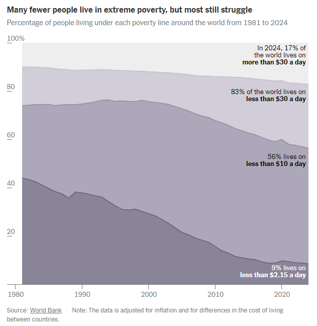
Just 17% of the global population lives on more than $30 a day.1
These numbers provide some perspective for how good we have it in this country. Yes, there are major problems here but we are by far the richest country in the world.
It might not seem like it sometimes, but that wealth has translated into higher levels of happiness too.
People who live in richer countries tend to be happier, all else equal: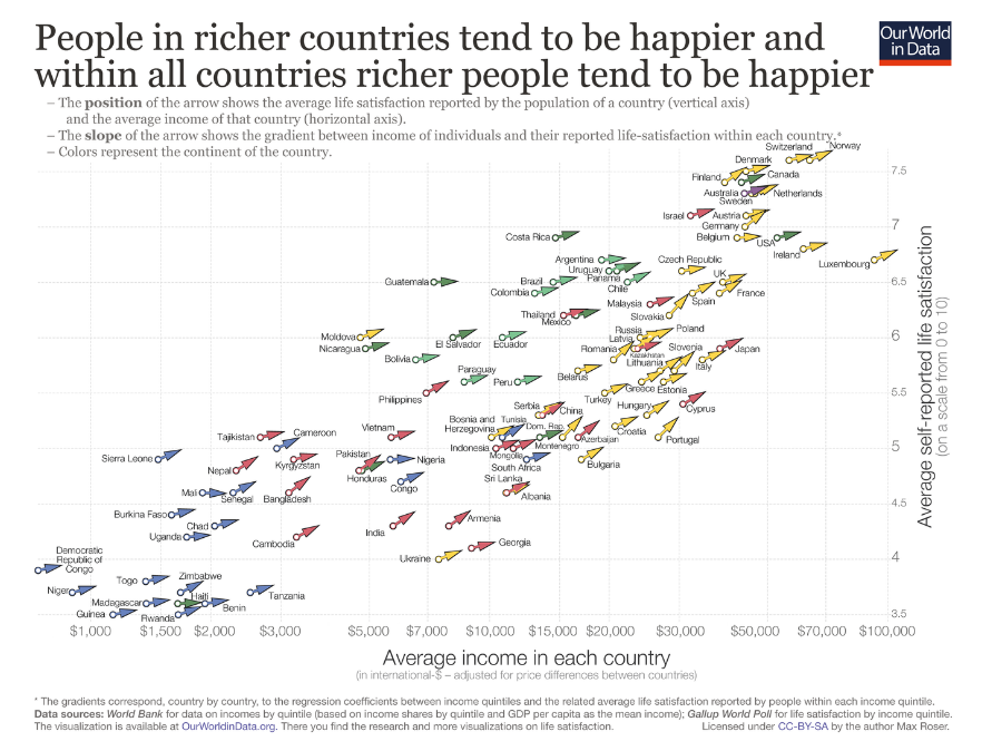
There are plenty of people in America who feel the average wages in this country are too low. They probably are based on the inequality but look at some of the average incomes on the lefthand side of the chart.
I did a double-take when I saw the number of countries with average incomes under $10k a year.
Wealth and income numbers are always viewed through the lens of peers, co-workers or people who are doing better than you. In many ways, this is one of the reasons we’ve experienced so much progress over time. No one is ever content.
It’s not going to solve all of your problems to know there are people worse off than you. Our brains don’t work like that.
Money is not everything, of course, but consider yourself lucky if you live in a country with a high standard of living.
Life could always be better but it could be worse too.
Further Reading:
50 Ways the World is Getting Better
1In America, 84% of people live on more than $30 a day. In 1964, it was half the population.
This content, which contains security-related opinions and/or information, is provided for informational purposes only and should not be relied upon in any manner as professional advice, or an endorsement of any practices, products or services. There can be no guarantees or assurances that the views expressed here will be applicable for any particular facts or circumstances, and should not be relied upon in any manner. You should consult your own advisers as to legal, business, tax, and other related matters concerning any investment.
The commentary in this “post” (including any related blog, podcasts, videos, and social media) reflects the personal opinions, viewpoints, and analyses of the Ritholtz Wealth Management employees providing such comments, and should not be regarded the views of Ritholtz Wealth Management LLC. or its respective affiliates or as a description of advisory services provided by Ritholtz Wealth Management or performance returns of any Ritholtz Wealth Management Investments client.
References to any securities or digital assets, or performance data, are for illustrative purposes only and do not constitute an investment recommendation or offer to provide investment advisory services. Charts and graphs provided within are for informational purposes solely and should not be relied upon when making any investment decision. Past performance is not indicative of future results. The content speaks only as of the date indicated. Any projections, estimates, forecasts, targets, prospects, and/or opinions expressed in these materials are subject to change without notice and may differ or be contrary to opinions expressed by others.
The Compound Media, Inc., an affiliate of Ritholtz Wealth Management, receives payment from various entities for advertisements in affiliated podcasts, blogs and emails. Inclusion of such advertisements does not constitute or imply endorsement, sponsorship or recommendation thereof, or any affiliation therewith, by the Content Creator or by Ritholtz Wealth Management or any of its employees. Investments in securities involve the risk of loss. For additional advertisement disclaimers see here: https://www.ritholtzwealth.com/advertising-disclaimers
Please see disclosures here.